We estimate the effect of AQAs on school absences with a simple ordinary least squares model of absences on neighborhood \(i\) at time \(t\) as a function of a treatment indicator equal to one if there is an alert.@eq-ols shows the econometric specification of the OLS estimator.
\[ Absent_{it} = \beta Treat_{t} + f(Temp_t, Rain_t) + AQI_t + \Omega_t + \lambda_i + \epsilon_{it} \tag{1}\]
In it, \(Absent_{it}\) is a panel-vector of absences at time \(t\) across all neighborhoods in New York City. \(Treat_{t}\) is an indicator variable equal to one if the New York State Department of Environmental Conservation emits an alert at \(t\). \(\beta\) is the point estimate of interest capturing the relationship between the alert dummy and school absenteeism. I account for the biasing effects of weather covariates by explicitly controlling for temperature and precipitation. Mainly, I remain agnostic on the relationship between weather and school absences by specifying \(k-1\) quintile indicator variables for temperature and rain. Next, I consider the effect of pollution exposure on school absences by accounting for the actual value of the air quality index at \(t\) (\(AQI_t\)). I incorporate seasonality into the empirical model through time-dependent fixed effects (\(\Omega_t\)). Specifically, I include year, month, and weekday fixed effects alongside an indicator variable of day types controlling for exogenous weather or administrative shocks to school absences. Finally \(\lambda_i\) are neighborhood fixed effects and \(epsilon_{it}\) the error term clustered at the neighborhood-by-week level to account for the possibility of inter-temporal correlation within neighborhoods and school weeks.
Table 1 contains the results of estimating the Equation 1 in levels across three different specifications. (1) controls for weather and air pollution at \(t\) alongside neighborhood fixed effects and an indicator variable for day-types controlling for unobservable shocks to school absences like hurricanes or general examinations. (2) further includes weekday, month, and year fixed effects to account for seasonality. Finally, (3) is a more restrictive design capturing the effect of the alerts on school absences from within neighborhood-month variation in absenteeism by adding the interaction of neighborhood, year, and month fixed effects. Furthermore (3) also assumes different weekday patterns across neighborhood by including neighborhood-by-weekday fixed effects.
Show the Code
# Set the path of the R-studio project
file = gsub("website", "", getwd())

# Load the results
tab = list(`OLS` = read_rds(paste0(file, "/02_GenData/06_RegResults/01_rdd/MainOls.rds")),
           `OLS (Log)` = read_rds(paste0(file, "/02_GenData/06_RegResults/01_rdd/LogOls.rds")))

# bind the list elements
tab = reduce(tab,cbind)

# Add the commas to numeric elements
tab["N.obs",] = comma(as.numeric(tab["N.obs",]))
tab["BIC",] = comma(as.numeric(tab["BIC",]))

# Make the table
kbl(tab, align = "lcccccc", digits = 2, booktabs = T) %>%
  kable_classic_2(bootstrap_option = c("hover"), full_width = F) %>%
  pack_rows("Fitted-Statistics", 3, 5) %>%
add_header_above(c(" " = 1, "OLS" = 3, "OLS (Log)" = 3))OLS |
OLS (Log) |
|||||
|---|---|---|---|---|---|---|
| 1 | 2 | 3 | 1 | 2 | 3 | |
| Estimate | 112.90 *** | 64.94 *** | 62.93 *** | 19.57 *** | 9.63 *** | 9.41 *** |
| (9.39) | (8.54) | (7.50) | (1.16) | (0.99) | (0.87) | |
| Fitted-Statistics | ||||||
| N.obs | 355,144 | 355,144 | 355,144 | 355,144 | 355,144 | 355,144 |
| R2 | 0.64 | 0.68 | 0.73 | 0.83 | 0.86 | 0.89 |
| BIC | 4,946 | 4,908 | 5,107 | 337 | 265 | 426 |
Notes: Effects of air quality health advisories on school absences in New York City. Point estimates come from an OLS and Log-OLS estimator of daily school absences per neighborhood as a function of an indicator variable equal to one in days with air quality health advisories. We present results across three specifications. (1) controls for the realized air quality index at \(t\), quintile indicator variables of temperature and precipitation, neighborhood fixed effects, and indicators of abnormal events. (2) adds weekday, month, and year fixed-effects to account for seasonality. (3) is a more restrictive design assuming neighborhood-specific seasonal trends with year-by-month-by-nta and weekday-by-nta fixed effects. Interpret the OLS estimates as the effect in absences because of the advisory and the Log-OLS coefficients as the percentage increase in absences (\(\beta\) = (exp()-1)). Standard errors clustered at the neighborhood-by-week level to account for possible inter-temporal correlations within cities and weeks of the year. Significance Codes: : 0.01, : 0.05, : 0.1
Across all specifications, the OLS results suggest that AQAs increase school absences by 112.9 in the most parsimonious model and 62.9 in the full model with high-dimensional fixed effects. According to the Bayes Information Criteria (BIC), the second column without high-dimensional fixed effects is the prefered specification. It implies 64.9 additional missing students per NYC neighborhood on days with AQAs. The OLS-Log model provides elasticities by estimating the effect on the log of school absences as dependent variable. Results imply that the raise in school absences translates to percentage increase between 9.41% and 19.57%.
We perform different robustness exercises to check the stability of point estimates. Figure 1 shows the effect of changing the specification of weather controls across six different models. 2) Is the preferred specification with quintile indicator variables of rain and temperature. 1) excludes all weather controls from the estimation. 3)Changes the quintile indicator variables to decile indicator variables. 4) Only controls linearly for temperature and precipitation. 5) adds to d a linear specification of relative humidity, wind speed, and atmospheric pressure. And f) includes the quintile indicator variables of temperature and precipitation alongside linear controls for relative humidity, wind speed, and atmospheric pressure.
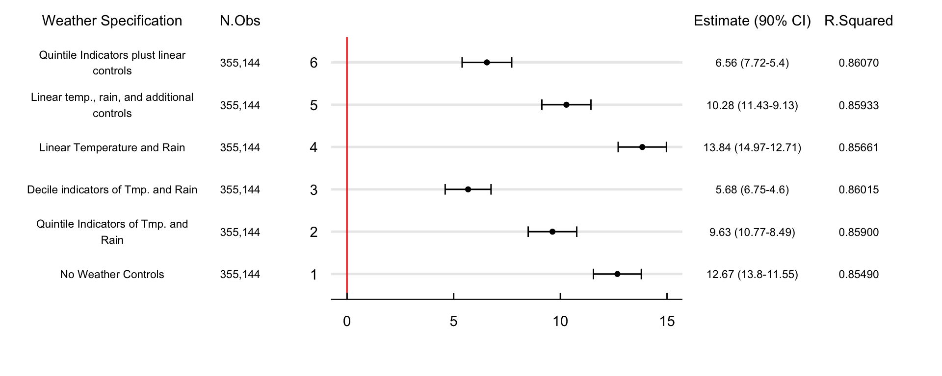
The effect of the AQAs on school absences remains positive and significant across specifications. The estimates go from 5.68% to 13.83% in the fourth and third specifications. On the one hand, using decile indicators (3rd design) may decrease point estimates by significantly reducing the available variance we need to identify the effect. On the other, controlling linearly for temperature and precipitation (4th design) may not account for nonlinearities in the weather-absences relationship.
Figure 2 shows effect of controlling for students’ exposure to the realized AQI in different ways. 1) excludes the AQI from the preferred specification. 2) controls linearly for the AQI and is our prefered specification. 3) includes a quadratic representation of the AQI. 4) controls for exposure with k-1 quintile indicator variables of the AQI. And 5) changes the quintile for decile indicator variables of exposure. Across all specifications, there are no significant changes in the effect of AQAs on school absences.
Show the Code
# Set the path of the R-studio project
file = gsub("website", "", getwd())

# Load the data
data = read_rds(paste0(file, "/02_GenData/06_RegResults/01_rdd/OlsRobustAqi.rds"))

# Add the specification
data = mutate(data, notes = c("No Air quality index", "Linear AQI",
                              "Quadratic AQI", "Quintile AQI", "Decile AQI"))
# Add the confidence intervals
data = mutate(data, up = estimate + std.error*1.64,
              down = estimate - std.error*1.645,
              ci = paste0(round(estimate,2), " (", round(up, 2),"-", round(down, 2), ")"))

# Add the limits of the plot
max = filter(data, up == max(up))$up; min = 0
maxy = length(unique(data$spec)) + 1

data = mutate(data, spec = as.character(spec))
# Plot the estimates
ggplot(data) +
  geom_errorbar(aes(y = spec, xmax = up, xmin = down),width = 0.25)  +
  geom_point(aes(x = estimate, y = spec)) +
  geom_vline(aes(xintercept = 0), color = "red") +

  labs(x = "", y = "") + coord_cartesian(xlim = c(0, max), ylim = c(1, 5), clip = "off")  +

  annotate("text", label = "Estimate (90% CI)", x = 19, y = maxy) +
  annotate("text", label = data$ci, x = 19, y = data$spec, size = 3) +

  annotate("text", label = "FEs Specification" , x = -10, y = maxy) +
  annotate("text", label = str_wrap(data$notes, 20) , x = -10, y = data$spec, size = 3) +

  annotate("text", label = "N.Obs" , x = -5, y = maxy) +
  annotate("text", label = comma(data$n) , x = -5, y = data$spec, size = 3) +

  annotate("text", label = "R.Squared" , x = 23, y = maxy) +
  annotate("text", label = round(data$r2, 2) , x = 23, y = data$spec, size = 3) +


  theme_economist() %+replace%
  theme(plot.margin = margin(1, 7, 1, 8, unit = "cm"), plot.background = element_blank()) +
  grids("y")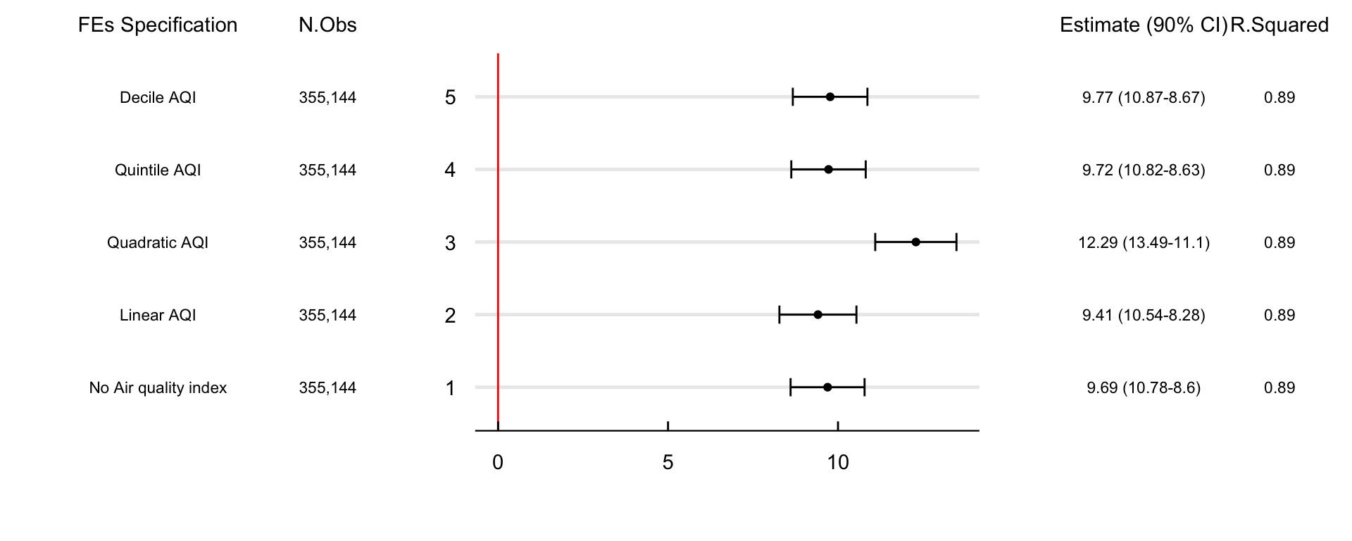
Figure 3 contains the confidence intervals of four different clustering specifications. 1) is the preferred specification with standard errors clustered at the nta-by-week level, 2) clusters at the nta-by-month, 3) at the nta-by-yer, and 4) at the neighborhood levels. Results show that the qualitative conclusions of the study are not sensitive to different clustering assumptions.
Show the Code
# Set the path of the R-studio project
file = gsub("website", "", getwd())

# Load the data
data = read_rds(paste0(file, "/02_GenData/06_RegResults/01_rdd/OlsRobustCluster.rds"))

# Add the specification
data = mutate(data, notes = c("Prefered Specification", "Nta-by-Month-by-Year",
                              "Nta-by-Year", "Neighborhood"))
# Add the confidence intervals
data = mutate(data, up = estimate + std.error*1.64,
              down = estimate - std.error*1.645,
              ci = paste0(round(estimate,2), " (", round(up, 2),"-", round(down, 2), ")"))

# Add the limits of the plot
max = filter(data, up == max(up))$up; min = 0
maxy = length(unique(data$spec)) + 1
data = mutate(data, spec = as.character(spec))

# Plot the estimates
ggplot(data) +
  geom_errorbar(aes(y = spec, xmax = up, xmin = down),width = 0.25)  +
  geom_point(aes(x = estimate, y = spec)) +
  geom_vline(aes(xintercept = 0), color = "red") +

  labs(x = "", y = "") + coord_cartesian(xlim = c(0, max), ylim = c(1, 4), clip = "off")  +

  annotate("text", label = "Estimate (90% CI)", x = 13, y = maxy) +
  annotate("text", label = data$ci, x = 13, y = data$spec, size = 3) +

  annotate("text", label = "SE Clustering" , x = -7, y = maxy) +
  annotate("text", label = str_wrap(data$notes, 20) , x = -7, y = data$spec, size = 3) +

  annotate("text", label = "N.Obs" , x = -3, y = maxy) +
  annotate("text", label = comma(data$n) , x = -3, y = data$spec, size = 3) +

  annotate("text", label = "R.Squared" , x = 17, y = maxy) +
  annotate("text", label = round(data$r2, 2) , x = 17, y = data$spec, size = 3) +


  theme_economist() %+replace%
  theme(plot.margin = margin(1, 7, 1, 8, unit = "cm"), plot.background = element_blank()) +
  grids("y")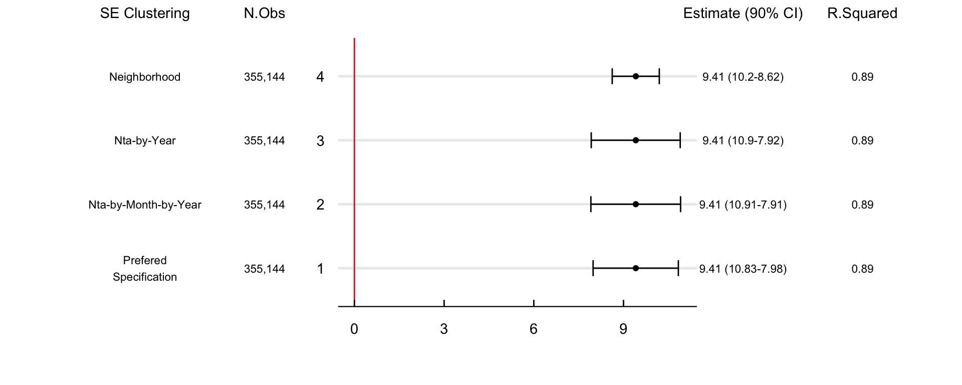
A relevant policy question is if the effect of the AQAs is heterogeneous across sub-populations. For instance, are the alert’s effect on school absences different across city boroughs, races, or social classes? And if so, what are the likely mechanisms behind this heterogeneity? Figure 4 estimates the difference in the effect of AQAs concerning The Bronx. Results show that AQAs increase school absences by 6.3% fewer kids in Staten Island. The estimate decreases for Queens and Brookyn and becomes indeistingishable from zero for Manhattan.
Show the Code
# Set the path of the R-studio project
file = gsub("website", "", getwd())

# Load the data
data = read_rds(paste0(file, "/02_GenData/06_RegResults/01_rdd/BoroOls.rds"))

# Compute the change w.r.t. The Bronx ####
data = mutate(data, ref = filter(data, term == "treated")$estimate)

data = filter(data, term != "treated")

# Add the confidence intervals
data = mutate(data, up = estimate + std.error*1.64,
              down = estimate - std.error*1.645,
              ci = paste0(round(estimate,2), " (", round(up, 2),"-", round(down, 2), ")"))

# Add the limits of the plot
max = filter(data, up == max(up))$up; min = filter(data, down == min(down))$down
maxy = length(unique(data$boro)) +1

# Plot the estimates
ggplot(data) +

  geom_point(aes(y = reorder(boro, estimate), x = estimate)) +

  geom_errorbar(aes(y = reorder(boro, estimate),
                    xmin = estimate - std.error*1.645,
                    xmax = estimate + std.error*1.645), width = 0.2) +

  geom_vline(aes(xintercept = 0), color = "red") +

  coord_cartesian(xlim = c(min, max), clip = "off") + labs(x = "", y = "") +

  annotate("text", label = "Estimate (90% CI)", x = max + max*7, y = maxy) +
  annotate("text", label = data$ci, x = max + max*7, y = data$boro, size = 3) +

  annotate("text", label = str_wrap(paste("Reference Effect for The Bronx:", round(data$ref,2)), 20),
           x = min, y = 5, size = 4) +

  theme_economist() %+replace%
  theme(plot.margin = margin(1, 5, 1, 0, unit = "cm"), plot.background = element_blank(),
        axis.text.y = element_text(hjust = 0.05)) +
  grids("y")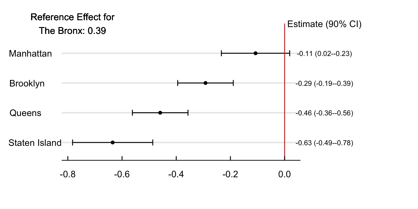
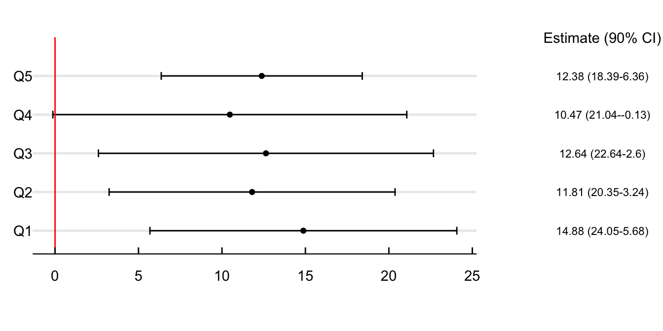
Figure 5 explores if this difference in point estimates between boroughs could relate to income. For this, I divide the sample by income quintiles and estimate the effect of the AQAs concerning the lowest quintile. Air quality alerts increase school absences the most for persons living in the less wealthy neighborhoods of the city. On days with air quality alerts, school absences in poor neighborhoods increase by 83.37%. This estimate decreases by 20.5% when looking at the second quintile and by more than 50% in Q3, Q4, and Q5.
Show the Code
# Set the path of the R-studio project
file = gsub("website", "", getwd())

# Load the data
data = read_rds(paste0(file, "/02_GenData/06_RegResults/01_rdd/IncomeOls.rds"))

# Compute the change w.r.t. to Q1 ####
data = mutate(data, ref = filter(data, term == "treated")$estimate)
data = filter(data, term != "treated")

# Add the confidence intervals
data = mutate(data, up = estimate + std.error*1.64,
              down = estimate - std.error*1.645,
              ci = paste0(round(estimate,2), " (", round(up, 2),"-", round(down, 2), ")"))
data = mutate(data, quintile = paste0("Q", quintile))

# Add the limits of the plot
max = filter(data, up == max(up))$up
min = filter(data, down == min(down))$down
maxy = length(unique(data$quintile)) +1

# Plot the estimates
ggplot(data) +

  geom_point(aes(y = quintile, x = estimate)) +

  geom_errorbar(aes(y = quintile,
                    xmin = estimate - std.error*1.645,
                    xmax = estimate + std.error*1.645), width = 0.2) +

  coord_cartesian(xlim = c(min, max), clip = "off") + labs(x = "", y = "") +

  annotate("text", label = "Estimate (90% CI)", x = max - max , y = maxy) +
  annotate("text", label = data$ci, x = max - max, y = data$quintile, size = 3) +

  annotate("text", label = str_wrap(paste("Reference Effect for Q1:", round(data$ref,2)), 20),
           x = min, y = 5, size = 4) +

  theme_economist() %+replace%
  theme(plot.margin = margin(1, 5, 1, 0, unit = "cm"), plot.background = element_blank(),
        axis.text.y = element_text(hjust = 0.05)) +
  grids("y")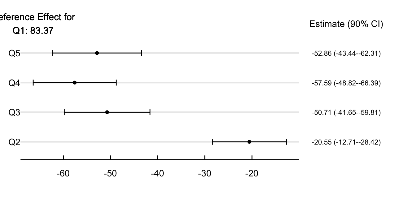
Figure 6 shows the difference in point estimates across neighborhoods in different quintiles regarding the share asthma ER admissions. The idea is that city areas more sensitive to air pollution would try to adapt to the alert more than other regions. Interpret all estimates concerning the first quintile (neighborhoods with the lowest asthma E.R. admissions). Air quality alerts increase absences in the healthiest neighborhoods by 1.52%. Although this effect is not statistically different from zero at Q2, we do see a smaller impact when looking at Q3 and Q4. In line with more sensitive groups adapting to the alert, we do find that the impact is a whooping 58.3% higher in neighborhoods at the upper part of the E.R. admissions distribution.
Show the Code
# Set the path of the R-studio project
file = gsub("website", "", getwd())
# Load the data
data = read_rds(paste0(file, "/02_GenData/06_RegResults/01_rdd/AsthmaErOls.rds"))

# Compute the change w.r.t. to Q3 ####
data = mutate(data, ref = filter(data, term == "treated")$estimate)
data = filter(data, term != "treated")

# Add the confidence intervals
data = mutate(data, up = estimate + std.error*1.64,
              down = estimate - std.error*1.645,
              ci = paste0(round(estimate,2), " (", round(up, 2),"-", round(down, 2), ")"))

# Change the Quintile to a character vector
data = mutate(data, quintile = paste0("Q", quintile))

# Add the limits of the plot
max = filter(data, up == max(up))$up
min = filter(data, down == min(down))$down
maxy = length(unique(data$quintile)) +1

# Plot the estimates
ggplot(data) +

  geom_point(aes(y = quintile, x = estimate)) +

  geom_errorbar(aes(y = quintile,
                    xmin = estimate - std.error*1.645,
                    xmax = estimate + std.error*1.645), width = 0.2) +

  geom_vline(aes(xintercept = 0), color = "red") +

  coord_cartesian(xlim = c(min, max), clip = "off") + labs(x = "", y = "") +

  annotate("text", label = "Estimate (90% CI)", x = max + max/3, y = maxy) +
  annotate("text", label = data$ci, x = max + max/3, y = data$quintile, size = 3) +

  annotate("text", label = str_wrap(paste("Reference Effect for Q1:", round(data$ref,2)), 20),
           x = 0, y = 5, size = 4) +

  theme_economist() %+replace%
  theme(plot.margin = margin(1, 5, 1, 0, unit = "cm"), plot.background = element_blank(),
        axis.text.y = element_text(hjust = 0.05)) +
  grids("y")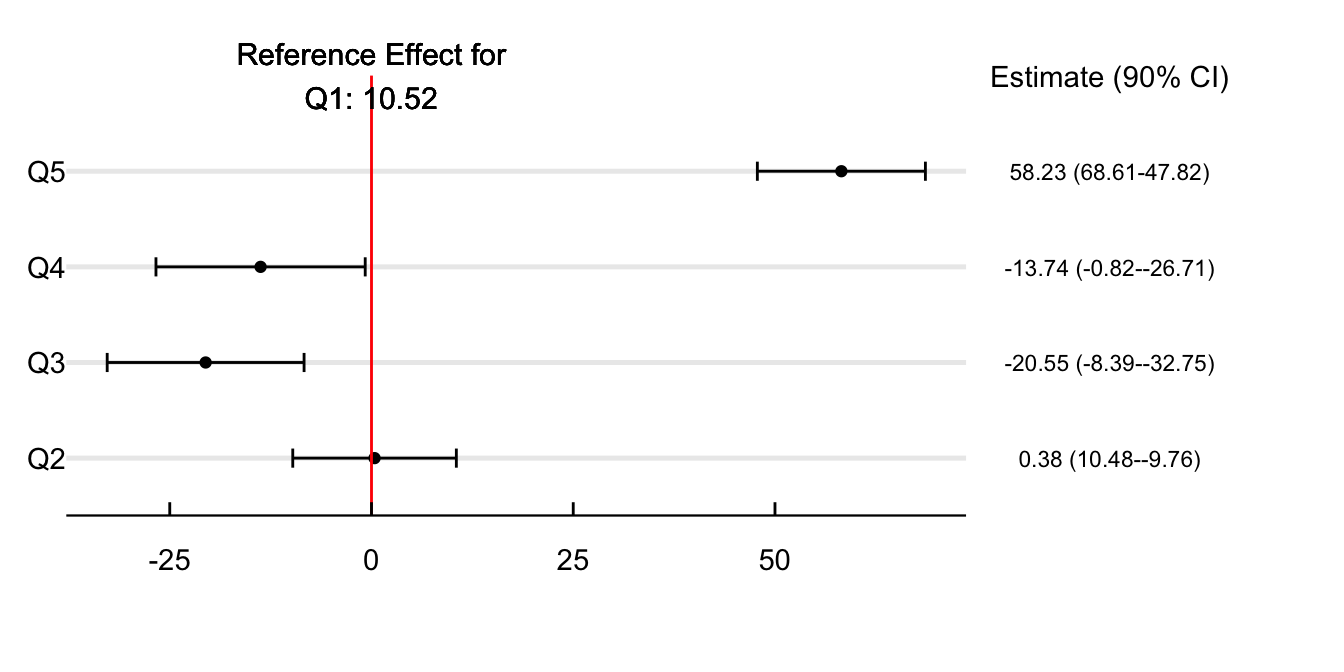
There are several potential issues with using OLS to estimate the relationship between the alerts and absenteeism. Unobservables that correlate with air pollution and absences may drive our coefficients if we fail to account for them with our fixed effects and weather controls. For instance, more traffic may increase the likelihood of missing schools and AQAs. In this section, we account for omitted variable bias by using the difference between the real and predicted AQI as an instrument for the alert.
The first stage of the IV specification is a Probit model on the probability of alerts. The second stage is the previously estimated OLS with the fitted value of the first stage as the causal variable. This strategy differs from a standard IV approach since the first stage is nonlinear and estimated via MLE instead of OLS. However, the intuition remains similar.
We use the difference between the real and observed AQI to instrument the emission of an AQA. Figure 7 shows the difference between the real and predicted AQI on alert and non-alert days. As the picture shows, the spread of the difference on days with an alert is higher than on days without (SD 26.8 vs. 14.6), meaning that the NYSDEC prediction algorithm has a higher bias in the neighborhood around the health advisory.
Show the Code
# Set the path of the R-studio project
file = gsub("website", "", getwd())
aqif = read_rds(paste0(file, "/02_GenData/02_aqi/AqiForecast.rds"))
aqi = read_rds(paste0(file, "/02_GenData/02_aqi/RealAqi.rds"))
#### Data for plotting daily differences between the AQI and the forecast ####
plot = filter(aqif, date < "2018-12-31")  %>% left_join(., aqi) |>
  mutate(diff = RealAqi - aqi) |>
  mutate(alert = ifelse(alert == 0, "No AQA", "AQA"))

# Plot the difference between days with alerts and no alerts
ggplot(plot) +
   geom_boxplot(aes(x = diff, color = alert, group = alert, y = alert),
                width = .50, fill = "transparent", outlier.shape = NA) +

  labs(x = "", y = "") +
  scale_fill_manual(values = c("#141F52", "#c91d42")) +
  scale_color_manual(values = c("#141F52", "#c91d42")) +

  theme_economist() %+replace%
  theme(legend.title = element_blank(), plot.background = element_blank(),
        axis.title.x = element_text(vjust = -2)) + grids("y")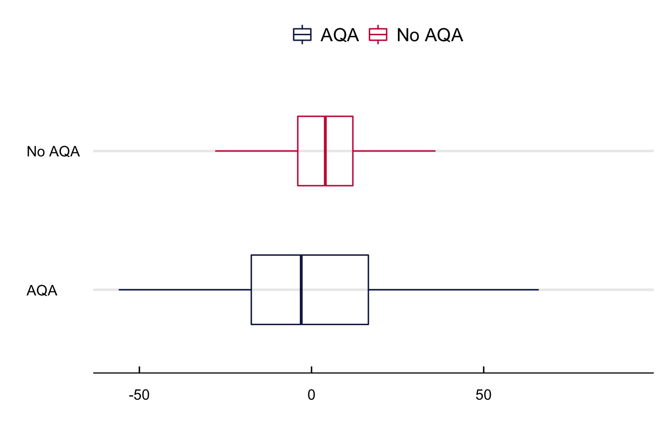
The primary IV assumption is that, after netting out the fixed effects and conditioning on meteorological conditions, the error in the forecast can only affect school absences through its influence on the probability the NYSDEC emits an alert. Unfortunately, we have no knowledge of the model used by the NYSDEC to predict the alerts and thus we are unable to test if the forecast error only affects absences through the alert (we need to know this algorithm).
We interpret point estimates as the local Average Treatment Effect (LATE) on the set of compliers, i.e., days with variation in the forecast error and a monotonic relationship between the error and the alert. Equation 2 presents the first stage of the IV strategy. In it, \(\mu_t\) is the error in the forecast (\(AQI_t - AQI^f_t\)) and \(Pr[AQI^f_t > 100]\) the probability of an air quality alert. Although we use the same set of controls as in the OLS, we estimate the first stage with a Probit estimator.
\[ Pr[AQI^f_t > 100] = \beta AQI_t + \mu_t + f(Temp_t, Rain_t) + \Omega_t + \lambda_i + \epsilon_{it} \quad \forall \quad \mu_t = AQI_t-AQI^f_t \tag{2}\]
First-stage regressions confirm that the difference between the real and forecast of the AQI are a good predictor of the alert. One unit increase in the absolute difference between the AQI and its forecast decreases the probability of an alert. Figure 8 shows the point estimates from the first-stage probit model of the alert as a function of the IV and the air quality index. While both are highly significant, they remain opposite in sign. The IV decreases the probability of an alert and the AQI increases it.
Show the Code
# Set the path of the R-studio project
file = gsub("website", "", getwd())

# Load the results
data = read_rds(paste0(file, "/02_GenData/06_RegResults/02_iv/FirstStageIV.rds"))

# Change the name of the causal variables
data = mutate(data, term = ifelse(term == "iv",
                                  str_wrap("A) Difference between the AQI and its forecast", 25),
                                  str_wrap("B) Air quality index", 25)))

# Add parenthesis to the specification
data = mutate(data, spec = paste0("(", spec, ")"))

# Plot the estimates
ggplot(data) +

  geom_point(aes(y = spec, x = estimate)) +

  geom_vline(aes(xintercept = 0), color = "black", linetype = "dashed") +

  geom_errorbar(aes(y = spec,
                    xmin = estimate - std.error*1.97,
                    xmax = estimate + std.error*1.97), width = 0.2) +
  facet_wrap(~term, scales = "free") +

  theme_economist() %+replace%
  theme(plot.background = element_blank(), axis.title.y = element_text(vjust = 2.5, angle = 90),
        axis.title.x = element_text(vjust = -2.5), strip.text = element_text(hjust = 0),
        axis.line.y = element_line()) +
  grids("y") + labs(x = "Point Estimate and 95% CI", y = "Specification") +
  scale_x_continuous(breaks = pretty_breaks())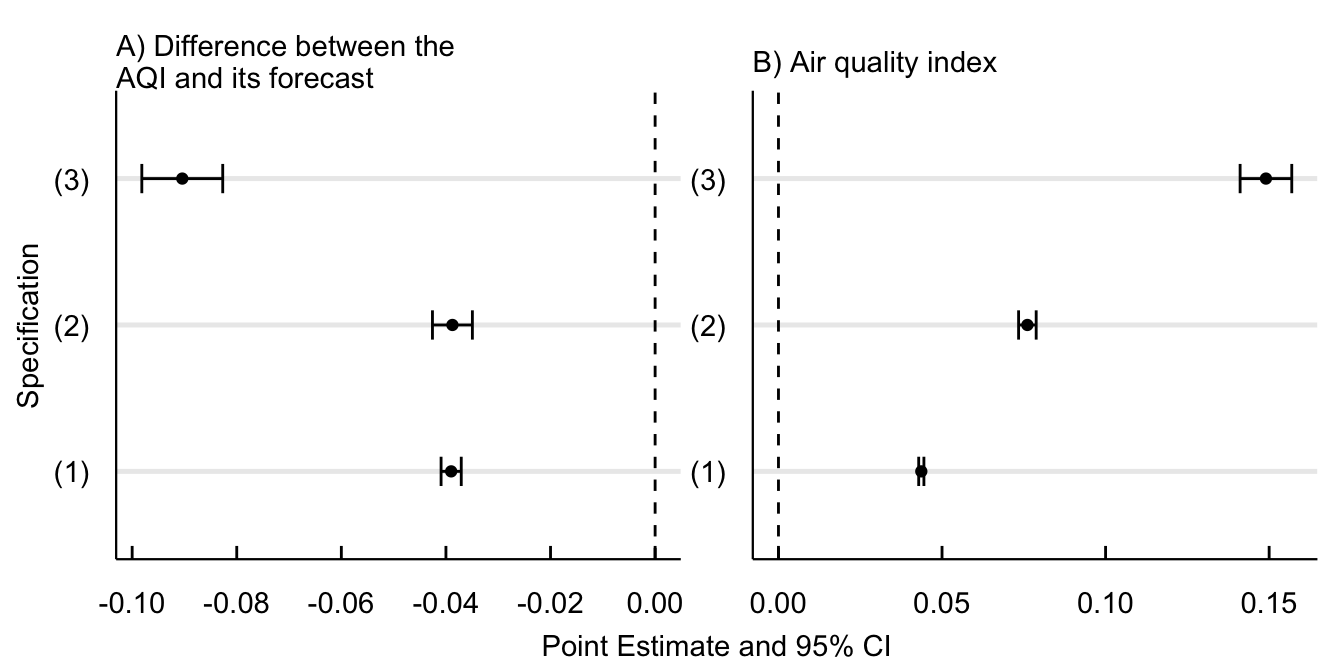
Show the Code
# Set the path of the R-studio project
file = gsub("website", "", getwd())

# Load the results
tab = list(`IV` = read_rds(paste0(file, "/02_GenData/06_RegResults/02_iv/LevelsIV.rds")),
           `IV-Log` = read_rds(paste0(file, "/02_GenData/06_RegResults/02_iv/MainIV.rds")))

# bind the list elements
tab = reduce(tab,cbind)

# Add the commas to numeric elements
tab["BIC",] = comma(as.numeric(tab["BIC",]))

# Make the table
kbl(tab, align = "lcccccc", digits = 2, booktabs = T) %>%
  kable_classic_2(bootstrap_option = c("hover"), full_width = F) %>%
  pack_rows("Fitted-Statistics", 3, 6) %>%
add_header_above(c(" " = 1, "IV" = 3, "IV (Log Absences)" = 3))IV |
IV (Log Absences) |
|||||
|---|---|---|---|---|---|---|
| (1) | (2) | (3) | (1) | (2) | (3) | |
| Estimate | 74.12 *** | 107.60 *** | 102.26 *** | 24.95 *** | 21.30 *** | 10.57 *** |
| (8.85) | (9.11) | (8.83) | (1.82) | (0.99) | (0.72) | |
| Fitted-Statistics | ||||||
| N.obs | 113,932 | 64,810 | 25,427 | 113,932 | 64,810 | 25,427 |
| R.Squared | 0.63 | 0.66 | 0.67 | 0.80 | 0.82 | 0.83 |
| BIC | 1,591 | 910 | 392 | 130 | 71 | 57 |
| F-test | 3,001 | 3,822 | 3,483 | 3,001 | 3,822 | 3,483 |
Notes: Effects of air quality health advisories on school absences in New York City. Point estimates come from an IV estimator of daily school absences per neighborhood as a function of the fitted values of an indicator variable equal to one in days with air quality health advisories. The first stage if the IV strategy estimates the probability of the alert with the difference between the real and predicted air quality index. We present results across three specifications. (1) controls for the realized air quality index at \(t\), quintile indicator variables of temperature and precipitation, neighborhood fixed effects, and indicators of abnormal events. (2) adds weekday, month, and year fixed-effects to account for seasonality. (3) is a more restrictive design assuming neighborhood-specific seasonal trends with year-by-month-by-nta and weekday-by-nta fixed effects. Interpret the OLS estimates as the effect in absences because of the advisory and the Log-OLS coefficients as the percentage increase in absences (\(\beta\) = (exp()-1)). Standard errors clustered at the neighborhood level to account for possible inter-temporal correlations within cities and weeks of the year. Significance Codes: : 0.01, : 0.05, : 0.1
Equation 3 RD specifies the functional form of the preferred RD model.
\[ Absent_{nt} = \beta D_{t}(AQI_{t} \geq 101) + \tilde{\mu}^- f(AQI_t)+ \tilde{\mu}^+ f(AQI{_t}\times D_{nt}) + W'_{nt} \Delta + \Omega_{t} + \epsilon_{t} \tag{3}\]
In it, \(Absent_{nt}\) is the log of absent students at neighborhood \(n\) on day \(t\), \(AQI_{t}\) is the AQI forecast at time \(t\), and \(D_{t}\) the treatment indicator equal to one when the AQI is higher than one hundred units. \(f(AQI_{t}\times D_{nt})\) is a linear fit before (\(\tilde{\mu}_{-}\)) and after (\(\tilde{\mu}_{+}\)) the discontinuity; I use a linear fit because it performs better and has more accurate boundary properties than higher-order polynomials @Gelman2019. \(W'_{nt}\) and \(\Omega_{t}\) are matrices of weather controls and time fixed-effects. The estimate of interest, \(\beta\), captures the LATE of the alert on school absences around the emission threshold. The bandwidth around the discontinuity comes from the data-driven plug-in rules based on mean squared error expansions proposed by @Calonico2015optimal.
Table 3 includes the results of the regression discontinuity design (in logs) across four different specifications. (1) estimates the effect of AQAs on school absences free of any control variables. (2) adds to the raw specification year, month, day of the week, and school period fixed effects. (3) further includes linear controls of temperature, rain, relative humidity, wind speed, and atmospheric pressure. (4) adds linear controls for the measured value of the AQI at time \(t\). To simplify the interpretation of coefficients, I transform the value of \(\beta\) to \([exp(\beta) -1]\) and interpret it as the percentage increase in school absences because of the air quality health advisory.
Results show an increase from between 7.72% and 17.08% in school absences because the air quality health advisory. The change in point estimates occurs because the inclusion of different covariates changes the optimal bandwidth of the RDD and thus the interpretation of point estimates. For instance, while the interpretation in the first column (raw RD) is the effect of the alerts within ten AQIs from the alert, the interpretation in the last column (full specification) is the effect of the alerts within sixteen AQIs from the alert conditional on seasonality, weather, and air pollution.
Log results
Show the Code
# Load the results
# Set the path of the R-studio project
file = gsub("website", "", getwd())
tab = read_rds(paste0(file, "/02_GenData/06_RegResults/01_rdd/NtaBase.rds"))
# Create the regression table
kbl(tab, align = "c") %>%
  kable_classic() %>% kable_styling(bootstrap_option = c("hover")) %>%
  pack_rows("Fitted-Statistics", 3, 5) %>%
  footnote(general = "Effects of air quality health advisories on school absences in New York City. Point estimates come from a regression discontinuity design. The score is equal to the distance between the forecasted air quality index and 101 units (the threshold for the emission of health advisories). The dependent variable is the log value of school absences at the neighborhood level. Interpret point estimates as the percentage increase in absences because of the advisory, e.g., an coefficient of two is equivalent to a two percent increase in absences. Cluster robsut standard errors in parenthesis. Significance Codes: ***: 0.01, **: 0.05, *: 0.1", general_title = "Notes:", footnote_as_chunk = T)
## Levels results
Table 3: Effect of the alert on school absences
| (1) | (2) | (3) | (4) | |
|---|---|---|---|---|
| Estimate | 9.29 ** | 7.72 ** | 14.37 *** | 17.08 *** |
| (4.60) | (3.85) | (3.50) | (3.49) | |
| Fitted-Statistics | ||||
| N.obs | 8416 | 10492 | 10868 | 10868 |
| Bandwidth | 10 | 13 | 16 | 16 |
| B.C. Bandwidth | 16 | 20 | 23 | 23 |
| Notes: Effects of air quality health advisories on school absences in New York City. Point estimates come from a regression discontinuity design. The score is equal to the distance between the forecasted air quality index and 101 units (the threshold for the emission of health advisories). The dependent variable is the log value of school absences at the neighborhood level. Interpret point estimates as the percentage increase in absences because of the advisory, e.g., an coefficient of two is equivalent to a two percent increase in absences. Cluster robsut standard errors in parenthesis. Significance Codes: ***: 0.01, **: 0.05, *: 0.1 | ||||
Show the Code
# Load the results
# Set the path of the R-studio project
file = gsub("website", "", getwd())
tab = read_rds(paste0(file, "/02_GenData/06_RegResults/01_rdd/NtaLevelsBase.rds"))
# Create the regression table
kbl(tab, align = "c") %>%
  kable_classic() %>% kable_styling(bootstrap_option = c("hover")) %>%
  pack_rows("Fitted-Statistics", 3, 5) %>%
  footnote(general = "Effects of air quality health advisories on school absences in New York City. Point estimates come from a regression discontinuity design. The score is equal to the distance between the forecasted air quality index and 101 units (the threshold for the emission of health advisories). The dependent variable is the log value of school absences at the neighborhood level. Interpret point estimates as the percentage increase in absences because of the advisory, e.g., an coefficient of two is equivalent to a two percent increase in absences. Cluster robsut standard errors in parenthesis. Significance Codes: ***: 0.01, **: 0.05, *: 0.1", general_title = "Notes:", footnote_as_chunk = T)
Table 4: Effect of the alert on school absences (In levels)
| (1) | (2) | (3) | (4) | |
|---|---|---|---|---|
| Estimate | 55.45 *** | 85.17 *** | 88.95 *** | 104.94 *** |
| (18.74) | (16.95) | (15.55) | (15.32) | |
| Fitted-Statistics | ||||
| N.obs | 8416 | 9550 | 10868 | 10868 |
| Bandwidth | 10 | 11 | 14 | 14 |
| B.C. Bandwidth | 15 | 18 | 21 | 21 |
| Notes: Effects of air quality health advisories on school absences in New York City. Point estimates come from a regression discontinuity design. The score is equal to the distance between the forecasted air quality index and 101 units (the threshold for the emission of health advisories). The dependent variable is the log value of school absences at the neighborhood level. Interpret point estimates as the percentage increase in absences because of the advisory, e.g., an coefficient of two is equivalent to a two percent increase in absences. Cluster robsut standard errors in parenthesis. Significance Codes: ***: 0.01, **: 0.05, *: 0.1 | ||||
:::
Appendix
OLS Splits
Show the Code
# Set the path of the R-studio project
file = gsub("website", "", getwd())

# Load the data
data = read_rds(paste0(file, "/02_GenData/06_RegResults/01_rdd/BoroOlsSplit.rds"))

# Add the confidence intervals
data = mutate(data, up = estimate + std.error*1.64,
              down = estimate - std.error*1.645,
              ci = paste0(round(estimate,2), " (", round(up, 2),"-", round(down, 2), ")"))

# Add the limits of the plot
max = filter(data, up == max(up))$up; min = filter(data, down == min(down))$down
maxy = length(unique(data$boro)) +1

# Plot the estimates
ggplot(data) +

  geom_point(aes(y = reorder(boro, estimate), x = estimate)) +

  geom_errorbar(aes(y = reorder(boro, estimate),
                    xmin = estimate - std.error*1.645,
                    xmax = estimate + std.error*1.645), width = 0.2) +

  geom_vline(aes(xintercept = 0), color = "red") +

  coord_cartesian(xlim = c(min, max), clip = "off") + labs(x = "", y = "") +

  annotate("text", label = "Estimate (90% CI)", x = max + max/2.75, y = maxy) +
  annotate("text", label = data$ci, x = max + max/2.75, y = data$boro, size = 3) +

  theme_economist() %+replace%
  theme(plot.margin = margin(1, 5, 1, 0, unit = "cm"), plot.background = element_blank(),
        axis.text.y = element_text(hjust = 0.05)) +
  grids("y")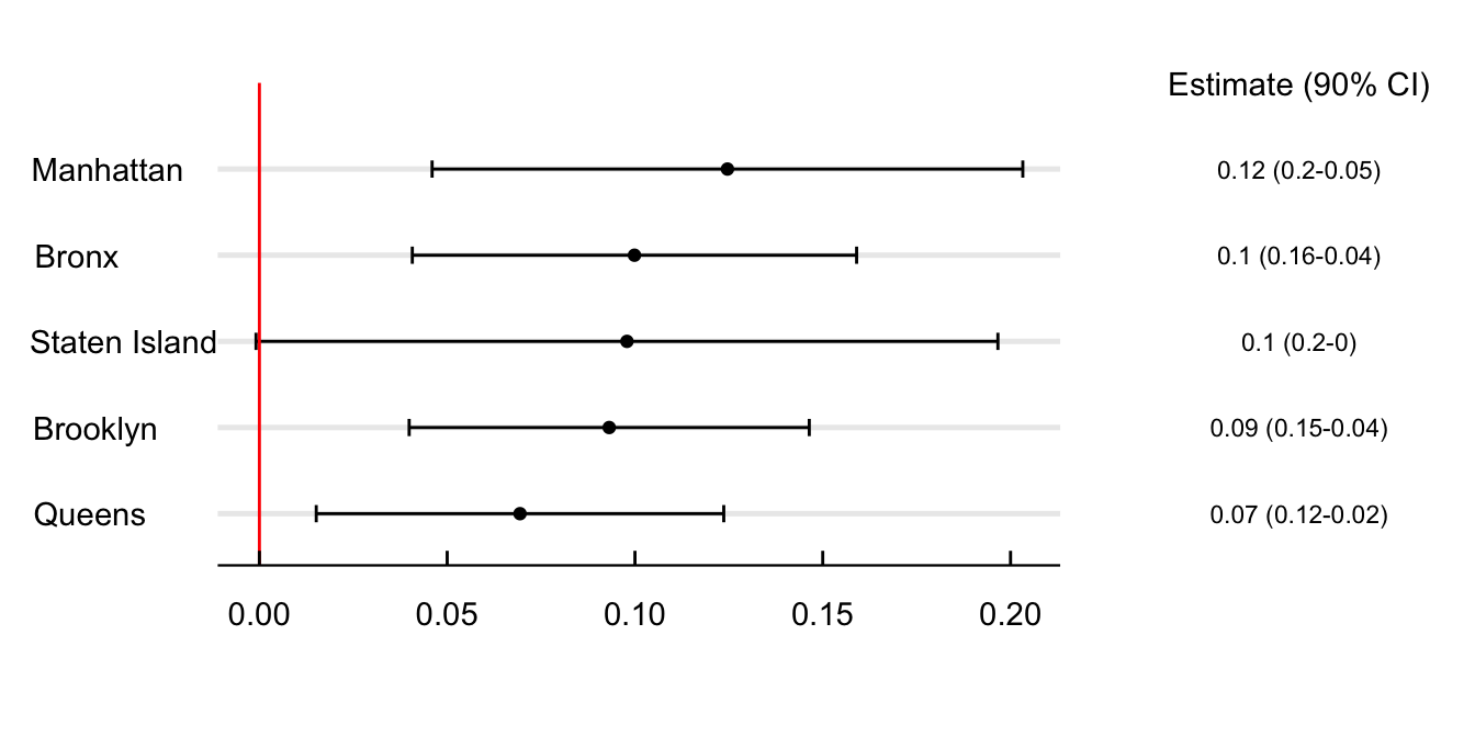
Show the Code
# Set the path of the R-studio project
file = gsub("website", "", getwd())

# Load the data
data = read_rds(paste0(file, "/02_GenData/06_RegResults/01_rdd/IncomeOlsSplit.rds"))

# Add the confidence intervals
data = mutate(data, up = estimate + std.error*1.64,
              down = estimate - std.error*1.645,
              ci = paste0(round(estimate,2), " (", round(up, 2),"-", round(down, 2), ")"))

# Add the limits of the plot
max = filter(data, up == max(up))$up; min = filter(data, down == min(down))$down
maxy = length(unique(data$quintile)) +1
data = mutate(data, quintile = paste0("Q", quintile))
# Plot the estimates
ggplot(data) +

  geom_point(aes(y = quintile, x = estimate)) +

  geom_errorbar(aes(y = quintile,
                    xmin = estimate - std.error*1.645,
                    xmax = estimate + std.error*1.645), width = 0.2) +

  geom_vline(aes(xintercept = 0), color = "red") +

  coord_cartesian(xlim = c(min, max), clip = "off") + labs(x = "", y = "") +

  annotate("text", label = "Estimate (90% CI)", x = max + max/2.75, y = maxy) +
  annotate("text", label = data$ci, x = max + max/2.75, y = data$quintile, size = 3) +

  theme_economist() %+replace%
  theme(plot.margin = margin(1, 5, 1, 0, unit = "cm"), plot.background = element_blank(),
        axis.text.y = element_text(hjust = 0.05)) +
  grids("y")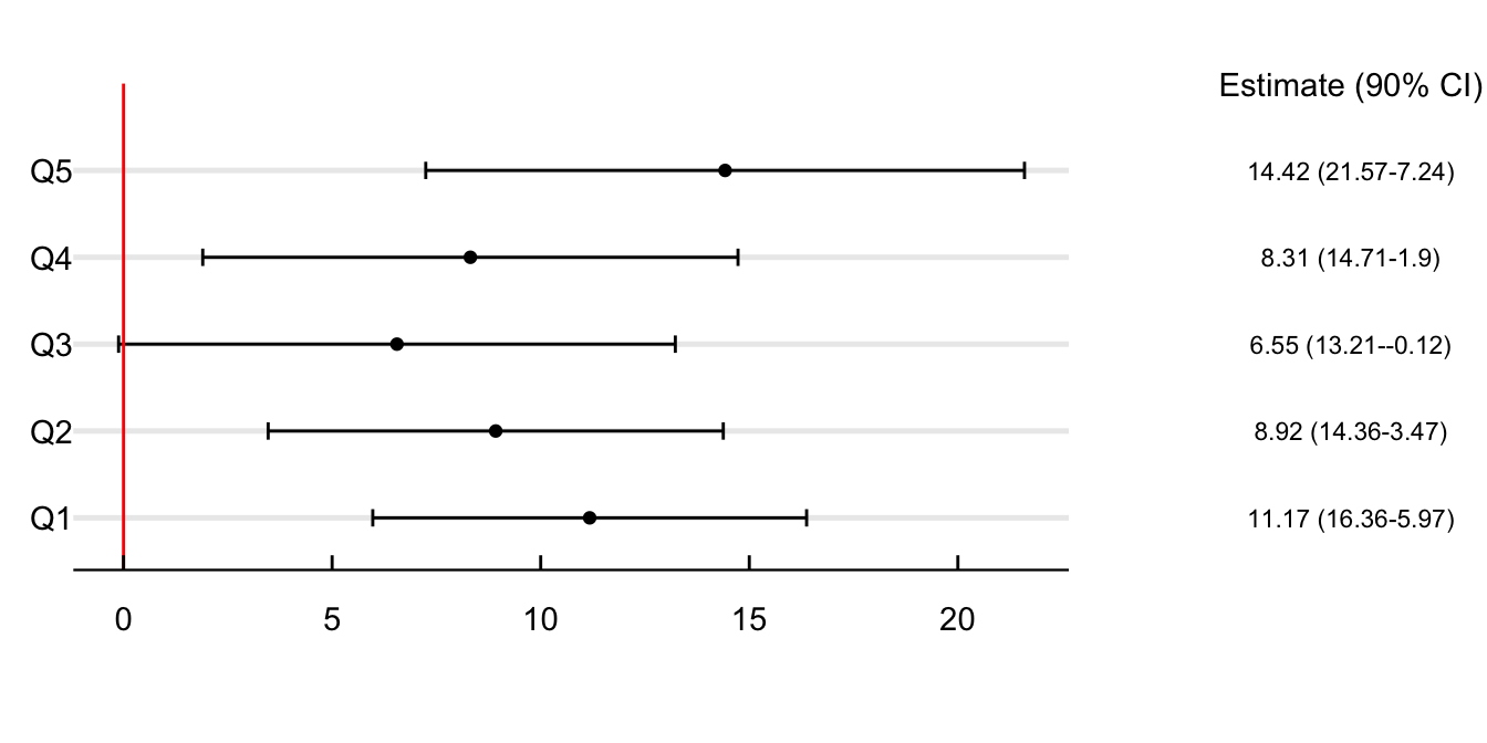
Show the Code
# Set the path of the R-studio project
file = gsub("website", "", getwd())

# Load the data
data = read_rds(paste0(file, "/02_GenData/06_RegResults/01_rdd/AsthmaErOlsSplit.rds"))

# Add the confidence intervals
data = mutate(data, up = estimate + std.error*1.64,
              down = estimate - std.error*1.645,
              ci = paste0(round(estimate,2), " (", round(up, 2),"-", round(down, 2), ")"))

# Add the limits of the plot
max = filter(data, up == max(up))$up; min = filter(data, down == min(down))$down
maxy = length(unique(data$quintile)) +1
data = mutate(data, quintile = paste0("Q", quintile))
# Plot the estimates
ggplot(data) +

  geom_point(aes(y = quintile, x = estimate)) +

  geom_errorbar(aes(y = quintile,
                    xmin = estimate - std.error*1.645,
                    xmax = estimate + std.error*1.645), width = 0.2) +

  geom_vline(aes(xintercept = 0), color = "red") +

  coord_cartesian(xlim = c(min, max), clip = "off") + labs(x = "", y = "") +

  annotate("text", label = "Estimate (90% CI)", x = max + max/2.75, y = maxy) +
  annotate("text", label = data$ci, x = max + max/2.75, y = data$quintile, size = 3) +

  theme_economist() %+replace%
  theme(plot.margin = margin(1, 5, 1, 0, unit = "cm"), plot.background = element_blank(),
        axis.text.y = element_text(hjust = 0.05)) +
  grids("y")